TextField
On this page, we focus on one of the components of Spheroid UI Engine, a TextField. You can find a quickstart with all source code you need to try the examples here.
Text fields are commonly integrated into forms (see more about Form). Though, of course, they can be used separately. In this case you can write a complex validation logic that a form does not allow you to implement.
Below, you will find the examples of using TextField class. The images corresponding to each example illustrate how the text will look on the mobile device.
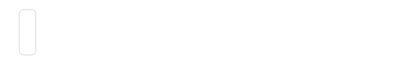
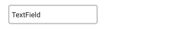
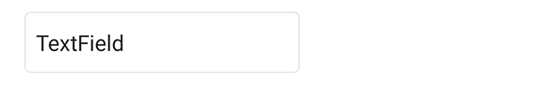
Default settings
This is how a text field will look without changing any default settings:
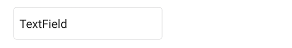
TextField()
Visibility
A text field is visible by default. However, there are
cases when you need to turn the visibility on and off. You do this by setting the isVisible
property value true or false.
Width and height
TextField(width = 200dp, height = 60dp)
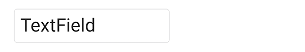
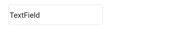
Value
Sometimes, you may want to improve user experience by showing the user pre-entered
text in text fields, so the user doesn’t have to type it in himself.
To do this, use the value property:
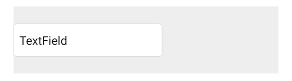
TextField(width = 200dp, value = "TextField")

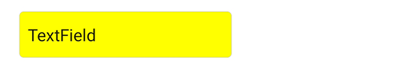
Background color
If you need to change the background color of a text field,
use the backgroundColor property:
TextField(width = 200dp, value = "TextField", backgroundColor = Color(rgb = 0xFFFF00))
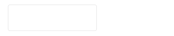
Border width
By default, a text field has a border. You can customize its width with the
borderWidth property:
TextField(width = 200dp, value = "TextField", borderWidth = 3dp)
You can remove the border altogether by setting borderWidth = 0.
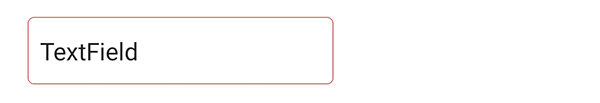
Border color
Set the borderColor property value to highlight the border:
TextField(width = 200dp, value = "TextField", borderColor = Color(rgb = 0xFF0000))
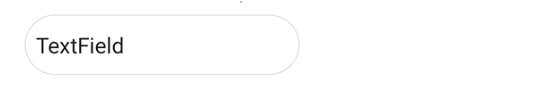
Corner radius
If you need to make the border rounded, use the cornerRadius property:
TextField(width = 200dp, value = "TextField", cornerRadius = 22dp)
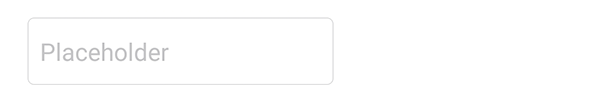
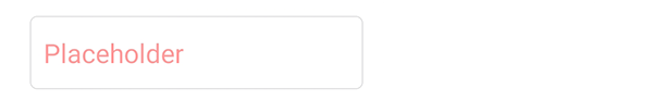
Placeholder
If you want to place a short hint to the expected value of the text field,
use the placeholder property:
TextField(width = 200dp, placeholder = "Placeholder")
Placeholder color
You can control the placeholder color using the placeholderColor property:
TextField(width = 200dp, placeholder = "Placeholder", placeholderColor = Color(rgba = 0xFF000066))
Text size
Use the textSize property to customize the text value size:
TextField(width = 200dp, value = "TextField", textSize = 24dp)
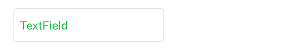
Text color
If you need to change the text value color, set the textColor property value using a
Color class instance:
TextField(width = 200dp, value = "TextField", textColor = Color(rgb = 0x34C759))
Tint color
You can set the cursor and text selection color using the tintColor property:
TextField(width = 200dp, value = "TextField", tintColor = Color(rgb = 0xFF00FF))
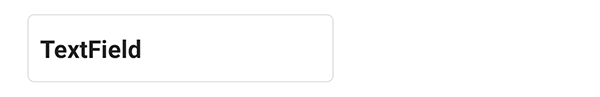
Font weight
By default, the text value font has normal weight.
To make it bold, set the fondWeight property:
TextField(width = 200dp, value = "TextField", fontWeight = "bold")
Padding
Using the padding property, you can control the distance
between the border’s left side and the text:
TextField(width = 200dp, value = "TextField", padding = 2dp)
Email and password fields
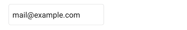
Set the isEmail property value to true for the field where the user types in his email.
Depending on the mobile device operational system, this will result in showing the user
a special keyboard layout for typing his email in. Commonly, the keyboard will have a “@”
symbol, and the first letter will be lowercase automatically.
TextField(width = 200dp, value = "mail@example.com", isEmail = true)
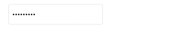
The isSecure property is typically used when creating a field where a user enters
the password:
TextField(width = 200dp, value = "TextField", isSecure = true)
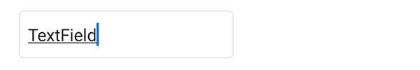
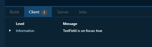
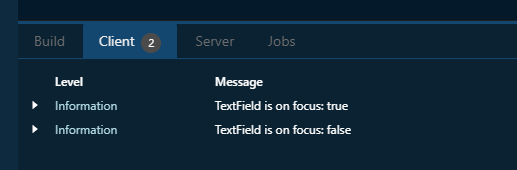
onFocusChange event handler
With the onFocusChange event handler, you have the means to execute a script
when the focus on the text field changes. This can be useful for design purposes
as well as for reacting to user behaviour and more.
In an example, we just want to print a log message when the focus changes:
TextField(width = 200dp, value = "TextField").onFocusChange { isOnFocus ->
    println("TextField is on focus: " + isOnFocus)
}
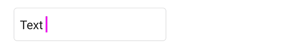
Focus is on the text field:
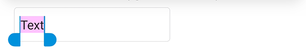
Focus has been moved away from the text field:
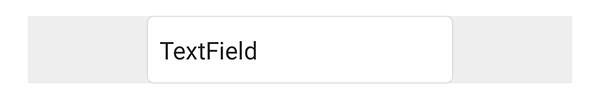
Horizontal and vertical alignment
Sometimes, you need to change the relative position of a text field to the external container. You have a set of properties to do this. Note that by default the container is transparent, so we have used a Color class instance in the examples.
The horizontalAlign property sets the horizontal alignment of the text field
to left, right or center:
Container(backgroundColor = Color(rgb = 0xEEEEEE)) {
    TextField(width = 200dp, value = "TextField", horizontalAlign = "center")
}
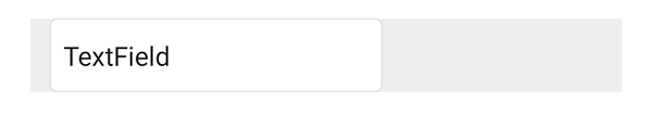
The left and right properties allow you to place the text field
at an exact distance from the left or the right border of the external container:
Container(backgroundColor = Color(rgb = 0xEEEEEE)) {
    TextField(width = 200dp, value = "TextField", left = 12dp)
}
The verticalAlign property sets the vertical alignment of the text field
to top, bottom or center:
Container(backgroundColor = Color(rgb = 0xEEEEEE), height = 90dp) {
    TextField(width = 200dp, value = "TextField", verticalAlign = "center")
}
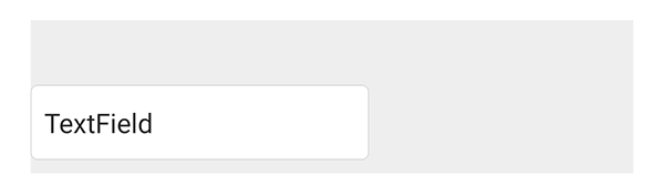
Using the top and bottom properties, you can customize
the distance between the text field and the top or the bottom border of the external container:
Container(backgroundColor = Color(rgb = 0xEEEEEE), height = 90dp) {
    TextField(width = 200dp, value = "TextField", bottom = 8dp)
}