Text
On this page, we focus on one of the components of Spheroid UI Engine, a Text. You can find a quickstart with all source code you need to try the examples here.
Using Text class allows you to incorporate texts into the pages of your app,
AR as well as non-AR. When creating an instance of Text class,
you need to set the text property value.
Below, you will find the examples of using Text class. The images corresponding to each example illustrate how the text will look on the mobile device.
Default settings
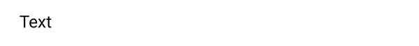
This is how the text will look on the page without changing the default settings:
Text(text = "Text")
Visibility
A text is visible by default. However, there are
cases when you need to turn the visibility on and off. You do this by setting the isVisible
property value true or false.
Text size
Use the textSize property to customize the text size:
Text(text = "Text", textSize = 24dp)

Text color
If you need to change the text color, set the textColor property value using a
Color class instance:
Text(text = "Text", textColor = Color(rgb = 0x34C759))

Text alignment
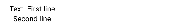
With the textAlign property, you can configure the text alignment in relation to itself:
Text(text = "Text. First line.\nSecond line.", textAlign = "center")
Font weight
By default, the text font has normal weight. To make it bold, set the fondWeight property:
Text(text = "Text", fontWeight = "bold")

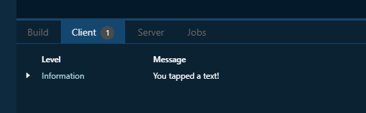
onClick event handler
With the onClick event handler, you have the means to execute a script
when the text is tapped. In an example, we just want to print a log message:
Text(text = "Text").onClick {
    println("You tapped a text!")
}

Width and height
Sometimes, you may need to define the area the text will occupy in advance.
For instance, this will be necessary if you want to group the text in two columns.
Your tools to do this will be the width and height properties:
Container(backgroundColor = Color(rgb = 0xEEEEEE)) {
    Text(text = "This is a text message.", horizontalAlign = "center", width = 120dp, height = 50dp)
}

Horizontal and vertical alignment
Often, you need to change the relative position of a text to the external container. You have a set of properties to do this. Note that by default the container is transparent, so we have used a Color class instance in the examples.
The horizontalAlign property sets the horizontal alignment of the text
to left, right or center:
Container(backgroundColor = Color(rgb = 0xEEEEEE)) {
    Text(text = "Text", horizontalAlign = "center")
}

The left and right properties allow you to place the text
at an exact distance from the left or the right border of the external container:
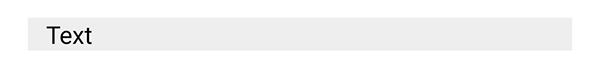
Container(backgroundColor = Color(rgb = 0xEEEEEE)) {
    Text(text = "Text", left = 12dp)
}
The verticalAlign property sets the vertical alignment of the text
to top, bottom or center:
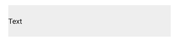
Container(backgroundColor = Color(rgb = 0xEEEEEE), height = 70dp) {
    Text(text = "Text", verticalAlign = "center")
}
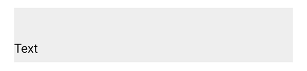
Using the top and bottom properties, you can customize
the distance between the text and the top or the bottom border of the external container:
Container(backgroundColor = Color(rgb = 0xEEEEEE), height = 70dp) {
    Text(text = "Text", bottom = 8dp)
}