Container
On this page, we focus on one of the basic components of Spheroid UI Engine, a Container. You can find a quickstart with all source code you need to try the examples here.
A container is an instrument allowing you to organize the content on screen. Buttons, images, animations, icons, text and other elements can be placed inside a container. A container can also be nested inside another container. In most cases, you don’t want to make the container visible on screen, so by default it’s transparent. However, sometimes you may need to style the container, for instance, change the alignment or rotate it.
Below, you will find the examples of using the Container class. The images corresponding to each example illustrate how the container will look on the mobile device when using different settings and styles.
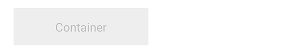
Basics
When creating an instance of the Container class, you don’t necessary need to set any properties.
However, as by default container is transparent, we’re using the
Color class instance in an example
to set the backgroundColor property value.
We’re setting the width and height property values as well.
Also, in an example we’re using the Text
component inside a container, to make it obvious where the container is,
as well as to demonstrate the possibility of placing elements inside a container.
Container(backgroundColor = Color(rgb = 0xEEEEEE), width = 180dp, height = 50dp) {
    Text(text = "Container", textColor = Color(rgba = 0x00000033), horizontalAlign = "center", verticalAlign = "center")
}

Visibility
A container is visible by default, though transparent.
However, there are cases when you need to turn the visibility on and off.
You do this by setting the isVisible property value true or false. If you set false,
all elements inside a container will become invisible too.
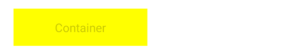
Background color
If you need to change the background color, use the backgroundColor property:
Container(backgroundColor = Color(rgb = 0xFFFF00), width = 180dp, height = 50dp) {
    Text(text = "Container", textColor = Color(rgba = 0x00000033), horizontalAlign = "center", verticalAlign = "center")
}
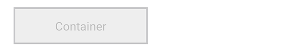
Border width
Use the borderWidth property to customize the border width of a container:
Container(backgroundColor = Color(rgb = 0xEEEEEE), width = 180dp, height = 50dp, borderWidth = 2dp) {
    Text(text = "Container", textColor = Color(rgba = 0x00000033), horizontalAlign = "center", verticalAlign = "center")
}
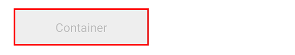
Border color
Set the borderColor property value to highlight the border:
Container(backgroundColor = Color(rgb = 0xEEEEEE), width = 180dp, height = 50dp, borderWidth = 2dp, borderColor = Color(rgb = 0xFF0000)) {
    Text(text = "Container", textColor = Color(rgba = 0x00000033), horizontalAlign = "center", verticalAlign = "center")
}
Corner radius
If you need to make the container rounded, use the cornerRadius property:
Container(backgroundColor = Color(rgb = 0xEEEEEE), width = 180dp, height = 50dp, cornerRadius = 12dp) {
    Text(text = "Container", textColor = Color(rgba = 0x00000033), horizontalAlign = "center", verticalAlign = "center")
}

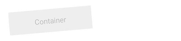
Rotation
Sometimes styling the content may requires rotating it. When you rotate a container,
all elements you placed inside it rotate as well.
Use Angle class to set
the rotation property value:
Container(height = 65dp) {
    Container(backgroundColor = Color(rgb = 0xEEEEEE), width = 180dp, height = 50dp, rotation = Angle(degree = -5), verticalAlign = "center", left = 1dp) {
        Text(text = "Container", textColor = Color(rgba = 0x00000033), horizontalAlign = "center", verticalAlign = "center")
    }
}
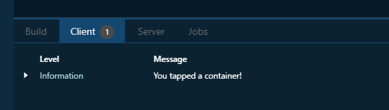
onClick event handler
With the onClick event handler, you have the means to execute a script
when any place inside a container is tapped.
This allows to emulate a button, as well as
to define an area that can be tapped to trigger the script execution.
In an example, we just want to print a log message:
Container(backgroundColor = Color(rgb = 0xEEEEEE), width = 180dp, height = 50dp) {
    Text(text = "Container", textColor = Color(rgba = 0x00000033), horizontalAlign = "center", verticalAlign = "center")
}.onClick {
    println("You tapped a container!")
}
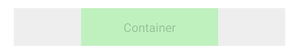
Horizontal and vertical alignment
In some cases, you need to change the relative position of one container to another container. You have a set of properties to do this.
The horizontalAlign property sets the horizontal alignment of the container
to left, right or center:
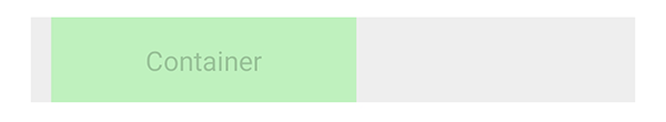
Container(backgroundColor = Color(rgb = 0xEEEEEE)) {
    Container(backgroundColor = Color(rgba = 0x00FF0033), width = 180dp, height = 50dp, horizontalAlign = "center") {
        Text(text = "Container", textColor = Color(rgba = 0x00000033), horizontalAlign = "center", verticalAlign = "center")
    }
}
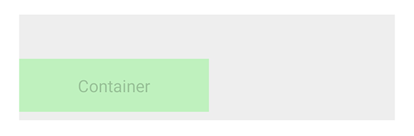
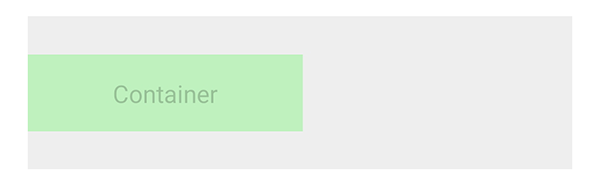
The left and right properties allow you to place the container
at an exact distance from the left or the right border of the bigger container:
Container(backgroundColor = Color(rgb = 0xEEEEEE)) {
    Container(backgroundColor = Color(rgba = 0x00FF0033), width = 180dp, height = 50dp, left = 12dp) {
        Text(text = "Container", textColor = Color(rgba = 0x00000033), horizontalAlign = "center", verticalAlign = "center")
    }
}
The verticalAlign property sets the vertical alignment of the container
to top, bottom or center:
Container(backgroundColor = Color(rgb = 0xEEEEEE), height = 100dp) {
    Container(backgroundColor = Color(rgba = 0x00FF0033), width = 180dp, height = 50dp, verticalAlign = "center") {
        Text(text = "Container", textColor = Color(rgba = 0x00000033), horizontalAlign = "center", verticalAlign = "center")
    }
}
Using the top and bottom properties, you can customize
the distance between the container and the top or the bottom border of the bigger container:
Container(backgroundColor = Color(rgb = 0xEEEEEE), height = 100dp) {
    Container(backgroundColor = Color(rgba = 0x00FF0033), width = 180dp, height = 50dp, bottom = 8dp) {
        Text(text = "Container", textColor = Color(rgba = 0x00000033), horizontalAlign = "center", verticalAlign = "center")
    }
}