Button
On this page, we focus on one of the basic components of Spheroid UI Engine, a Button. You can find a quickstart with all source code you need to try the examples here.
When creating an instance of the Button class, you need to set the text property.
The value should be the text you want to appear on the button.
Below, you will find the examples of using the Button class with different properties. The images corresponding to each example illustrate how the button will look on the mobile device when using different settings and styles.
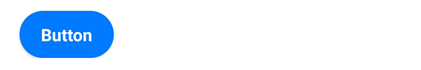
Default settings
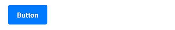
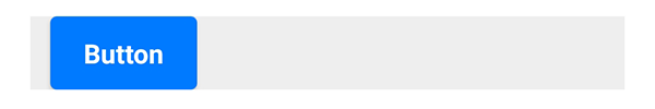
This is how the button looks by default:
Button(text = "Button")

Visibility
A button is visible by default. However, there are
cases when you need to turn the visibility on and off. You do this by setting the isVisible
property value true or false.
onClick event handler
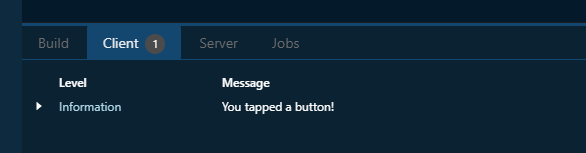
As you obviously will want to execute some kind of script when a button is tapped,
add the onClick event handler to a button. In an example, we just want to
print a log message:
Button(text = "Button").onClick {
    println("You tapped a button!")
}
The log is displayed in the “Client” tab of the Spheroid Demiurge IDE:
Color
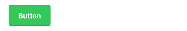
You can change the button’s color by setting the backgroundColor property
value using the Color class instance.
This is, for example, what you need to do if you want your button to be green:
Button(text = "Button", backgroundColor = Color(rgb = 0x34C759))
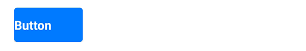
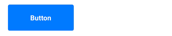
Corner radius
By default, a button is slightly rounded. You can make it more rounded by setting the
cornerRadius property with a higher value:
Button(text = "Button", cornerRadius = 22dp)
You also can remove the rounding by setting cornerRadius = 0.
Note that the same corner radius will look different when used on buttons of different width and height.
Text alignment
The textAlign property sets the button text alignment to left, right or center:
Button(text = "Button", textAlign = "left")
Width and height
The button size depends on the text length and adjusts automatically.
However, you can set fixed values using the width and height properties:
Button(text = "Button", width = 150dp, height = 60dp)
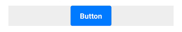
Horizontal and vertical alignment
A button exists in a container, and is aligned to top left by default. If you want to change these settings, use one of the following properties.
The horizontalAlign property sets the horizontal alignment of the button
to left, right or center:
Container(backgroundColor = Color(rgb = 0xEEEEEE)) {
    Button(text = "Button", horizontalAlign = "center")
}
The left and right properties allow you to place the button
at an exact distance from the left or the right border of the container:
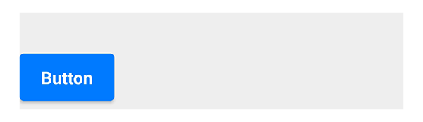
Container(backgroundColor = Color(rgb = 0xEEEEEE)) {
    Button(text = "Button", left = 12dp)
}
The verticalAlign property sets the vertical alignment of the button
to top, bottom or center:
Container(backgroundColor = Color(rgb = 0xEEEEEE), height = 90dp) {
    Button(text = "Button", verticalAlign = "center")
}
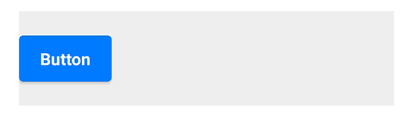
Using the top and bottom properties, you can customize
the distance between the button and the top or the bottom border of the container:
Container(backgroundColor = Color(rgb = 0xEEEEEE), height = 90dp) {
    Button(text = "Button", bottom = 8dp)
}